Echo Web Space

What we do

Responsive Web Design

Driving brands forward online

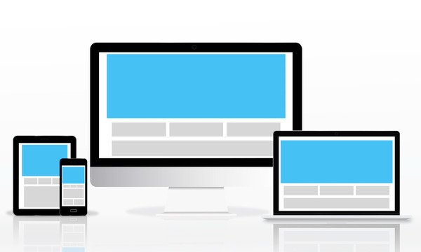
Deliver a Seamless Experience Across Every Screen

We design responsive websites that provide consistent experiences, improved engagement, and better accessibility helping your business reach users wherever they are.

Your website should look great and work flawlessly on every device, desktop, tablet, and mobile. Our Responsive Web Design services ensure your website adapts smoothly to different screen sizes, resolutions, and orientations without compromising usability or performance.

With the majority of users browsing on mobile devices, a responsive website is no longer optional, it’s essential. A non-responsive site can frustrate users, increase bounce rates, and negatively impact search rankings.

Responsive web design ensures your content adjusts automatically to fit any device, making navigation effortless and content readable. It improves user experience, boosts SEO performance, and helps convert visitors into customers by offering a smooth, distraction-free browsing experience.

Why Choose Our Responsive Design Services

User-Centric Design Philosophy : We design with real users in mind — focusing on comfort, clarity, and accessibility on every device.
SEO & Performance Focused : Search engines favor responsive websites. Our designs support  faster performance.
Seamless WordPress Integration : We ensure your responsive design works perfectly with themes, plugins, and future updates.
Scalable & Future-Ready : Our responsive layouts are built to adapt to new devices and screen sizes as technology evolves.
Reliable Delivery & Support : From planning to post-launch care, we ensure quality, transparency, and long-term reliability.

Our Responsive Web Design Services

Mobile-First Design Approach

We design with mobile users in mind first then scale up for tablets and desktops. This ensures your website is fast, focused, and optimized for modern browsing habits.

Cross-Browser & Device Compatibility

We test designs across multiple devices, operating systems, and browsers to ensure reliable performance everywhere.

Fluid Layouts & Flexible Grids

Our layouts adapt seamlessly to different screen sizes using flexible grids and scalable elements, ensuring consistent structure and visual balance across devices.

Performance-Optimized Responsiveness

Responsive doesn’t mean heavy. We optimize assets and layouts to keep your site lightweight, fast, and efficient on all devices.

Responsive Typography & Media

Text, images, and videos adjust automatically for readability and performance delivering clarity without excessive scrolling or zooming.

How We Build Responsive Websites

Our responsive web design process follows a structured, user-first approach to ensure your website adapts seamlessly across all devices while maintaining performance, usability, and visual consistency.
Discovery & Device Analysis
We analyze your audience behavior, device usage, and content needs to define the best responsive strategy for your website.
Layout Planning & Breakpoints
We design layouts for multiple screen sizes and define breakpoints to ensure smooth transitions between devices.
Visual Design & UI Scaling
We create responsive UI designs that scale gracefully maintaining usability, spacing, and clarity at every size.
Development & Implementation
We implement responsive designs using modern CSS techniques and WordPress best practices for consistent behavior.
Testing & Optimization
We rigorously test responsiveness, speed, touch interaction, and readability before launch.
Launch & Ongoing Support
After launch, we provide updates, refinements, and support to keep your site responsive as technology evolves.

Most common questions clients ask

Responsive web design allows a website to automatically adjust its layout and content based on the screen size and device being used.
No — when done correctly, responsive design improves performance by optimizing content for each device.
Yes. Search engines prioritize mobile-friendly and responsive websites, which helps improve rankings.
Absolutely. We can redesign or optimize your current site to make it fully responsive.
No. Responsive design eliminates the need for a separate mobile site by using a single flexible layout.
Ready to Make Your Website Truly Responsive?

Give your users a consistent, high-quality experience on every device. Let’s build a responsive website that looks great, performs better, and supports your business goals.

Scroll to Top